
Paper-backed, foil and holographic stickers are different material treatments, not merely different colors of a flat logo. Their surfaces respond to light in different ways, and that response can matter as much as the artwork when you view a finished craft.
Keep the treatment, the design and the application separate. A material effect explains how a sticker appears; it does not tell you where it has been placed, whether it has been scraped or which exact item a picture shows.
The material treatment is separate from the sticker name, applied placement and scraped state.
Read the full variant name
Start with the issued item's complete name. Valve's descriptions distinguish objects such as Battle Scarred (Holo) and Crown (Foil). The words in parentheses are part of the identification, not a decorative caption you can ignore.
A thumbnail may suggest shine without showing which treatment creates it. A bright patch can come from a reflection, a pale region of artwork or an edited presentation. Use the full item record before trying to identify a variant from one small image.
Do not assume every artwork exists in every treatment. When a particular version matters, look for that actual item rather than constructing a name from a familiar logo and your preferred material word.
Paper-backed stickers have a surface and a backing
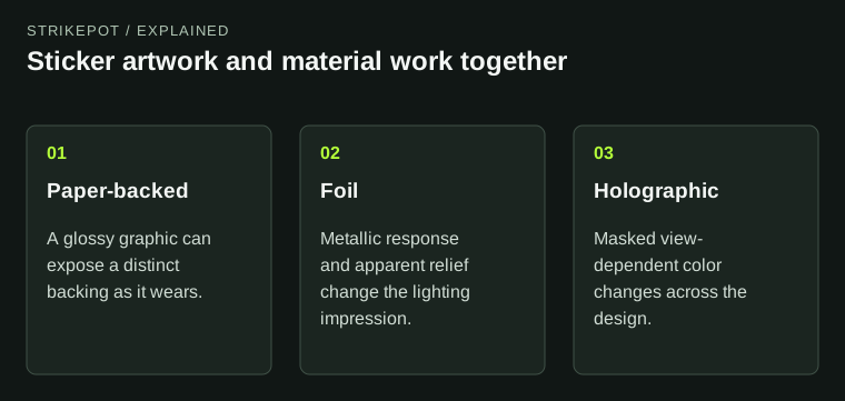
Valve's creation guide describes glossy paper-backed stickers as artwork with an underlying backing that can become apparent through wear. That gives the material a different visual structure from a bare painted mark.
For a hypothetical original emblem, the clean design might read as a crisp colored shape while worn areas introduce a lighter paper-like boundary. The visual question is whether those exposed areas support the composition or make the emblem harder to recognize.
The material does not need a spectacular lighting effect to be effective. A stable, readable shape can complement a busy weapon finish better than another highly active surface. That is an aesthetic relationship to inspect, not a universal ranking of sticker types.
Foil communicates a metallic surface
The same guide describes embossed foil through a metallic treatment and normal-map detail. The effect can suggest raised or pressed structure while responding strongly to the scene. A close-up may emphasize that relief more than the ordinary held view does.
Imagine the emblem made as a reflective metallic shape. Broad areas may catch a highlight while fine detail changes in visibility as the view turns. If the design relies on tiny marks, their readability should be checked under more than one favorable angle.
For creators, the material should serve the illustration. Making every region equally reflective can flatten the intended hierarchy into one bright shape. A clear silhouette and deliberate supporting detail often remain more useful than simply increasing the strength of the effect.
Holographic materials add angle-dependent color
Valve's guide describes holographic treatment using masks and a spectrum that changes the visible effect with the view. The artwork can therefore contain areas that behave differently rather than applying the same rainbow response everywhere.
A still image captures one state of that response. If two images show different colors, they may be showing a view-dependent effect rather than two different designs. Rotate the actual item or compare a short sequence before deciding which colors define the whole sticker.
For the hypothetical emblem, a creator might keep the central symbol stable while letting a border carry the shifting effect. Another idea might use the change as the main attraction. Both need clear masks and a composition that remains recognizable while the colors move.
Compare the sticker with the receiving finish
A sticker does not appear against an empty white sheet during play. Its neighboring weapon colors, surface detail and reflections influence how it reads. A pale outline may stand out on a dark panel and disappear against a bright graphic.
Compare the same intended placement using a representative view. Look at the silhouette first, then the material effect and finally small detail. If the emblem and the underlying finish compete for attention, a quieter treatment or another area may communicate the idea better.
The sticker application guide covers placement and irreversible changes. Use that before committing a craft. Understanding the material does not create a way to rearrange an already applied sticker.
Material effects also change how two stickers combine. Two shifting surfaces can compete for attention even when their flat colors match, while a steady graphic beside a reflective accent can create a clearer hierarchy. Inspect the combination as a small composition rather than judging each sticker in isolation. This is especially useful when a craft is intended to read in hand: a treatment that is spectacular in a close-up may become one bright patch at playing size. Choose the relationship you want before committing the layout.
Keep wear, treatment and identity separate
| Property | What it explains |
|---|---|
| Artwork and variant | Which issued sticker design and treatment you are viewing |
| Material response | How the surface behaves under light and changing angles |
| Applied state | Placement, visibility and any scraping on the actual weapon |
A faint area may be part of a worn applied sticker rather than proof that the material effect is missing. A brilliant promotional render may show the treatment clearly while saying little about the current craft. The inspection guide keeps the exact configuration attached to the item being considered.
Choose by the result you want to see: steady graphic readability, metallic relief, shifting color or a deliberate combination. The useful comparison is the actual design on its receiving weapon under representative views. A material label gives you a starting explanation, while the complete craft supplies the final visual answer.