
Changing a finish's brightness and changing its roughness solve different problems. Albedo describes the surface's reflectance. Roughness describes how smooth or rough its response is. A material can have the intended base color and still look wrong because its reflections communicate the wrong kind of surface.
For a CS2 creator, the useful habit is to name the material problem before adjusting controls. “Too dark” may mean an actual color issue, an overly dominant reflection or simply an unfavorable preview. Those possibilities require different revisions.
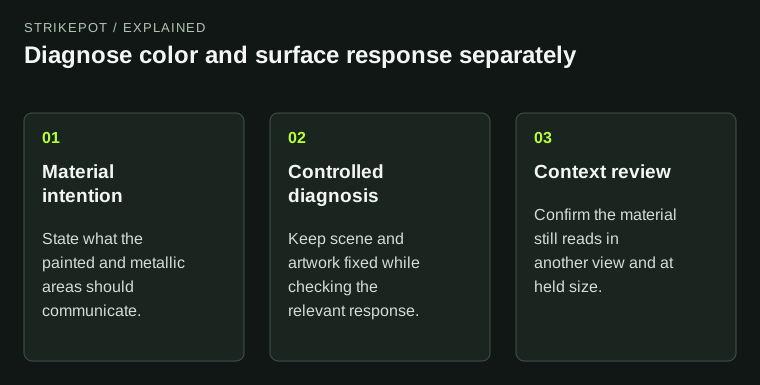
The workflow prevents a brightness adjustment from concealing a different material problem.
Decide what surface the design represents
Begin with a material statement in ordinary language. Is this supposed to read as painted metal, a colored metallic treatment or a deliberately contrasting combination? The answer gives your choices a reference. Without it, every attractive reflection can look like an improvement even when it contradicts the idea.
Consider a hypothetical finish with a calm painted field and a narrow reflective accent. If both areas respond in the same way, the separation may disappear despite different colors. If the accent overwhelms the whole weapon, its intended supporting role may be lost. Color and surface behavior need to work together.
You do not need an exhaustive simulation of a real manufacturing process. You do need a coherent visual claim. A viewer should be able to understand why one part feels different from another, rather than seeing unrelated effects applied because each looked impressive in isolation.
Use the current material conventions
Valve's current weapon-finish guide discusses albedo, roughness and reflectance ranges for different material types. Treat those as constraints on plausible behavior, not as a universal color palette. A value suitable for one material role may not serve another.
The same guide also documents style-specific channel conventions. This matters because a number has no useful meaning without its context. A value in a texture channel is not automatically interpreted in the same direction or range as a similarly named editor control.
Historical Phong documentation remains available and describes older highlight controls. It can explain a legacy example, but copying its numeric settings into a current workflow without checking the convention is a poor diagnosis. Preserve the distinction between a material principle and an old implementation detail.
Separate the base color from the highlight
Inspect a broad part of the surface and identify its brightest reflected area. Then look at the surrounding base region. If a white highlight dominates the view, reducing the base color may make the remainder muddy while leaving the underlying surface problem unresolved.
Try a controlled comparison in which the material version stays fixed and only the viewing angle changes. Does the complaint move with the reflection? If so, investigate the surface response before repainting the artwork. If an unwanted color remains across many angles, the color information may need closer attention.
This is an editorial review method rather than a measured test result. It helps you form a better hypothesis. The current tool's supported parameters and preview still determine what you can actually change.
Make revisions that answer one hypothesis
Suppose the reflective accent looks like a bright plastic sticker rather than a metallic inlay. Record that specific observation. Keep the artwork unchanged while testing the relevant material behavior. Then compare the same surface under the same scene and pose.
If the material becomes more convincing but the accent still dominates, the next issue may be composition or coverage. That is a different revision. Changing roughness, palette, pattern scale and layout at once might produce a pleasing image, but it will teach you little about why the first version failed.
Keep versions small and named. A before image, an after image and a one-sentence reason for the change are usually enough. This is particularly valuable in collaborative work, where “the blue version” can refer to several incompatible exports.
Check more than the most flattering scene
After isolating a problem in a stable review setup, look at another ordinary environment and a less flattering angle. The material should retain its identity even when it is not producing the ideal highlight. An accent can become quieter without becoming visually incoherent.
Also review the normal held size. A subtle response that looks excellent in a close-up may contribute very little during play. Conversely, a broad reflection can dominate the small held weapon even if it seems balanced in a large side render.
The inspection guide helps owners compare an actual item through useful views. Creators use a similar visual discipline while changing the material itself. The purpose differs, so keep the design version alongside the capture.
When a collaborator reviews the result, tell them the intended surface roles before asking which version they prefer. Otherwise, one person may choose the strongest reflection while another chooses the most restrained color, and both may be answering different questions. Agreement that the accent now reads as metal is a more useful technical milestone than agreement that the whole screenshot looks dramatic. Preference can be discussed after the material communicates its intended role.
Know when the remaining issue is not a material issue
Roughness cannot rescue an illustration placed behind a hand. Albedo cannot repair a broken pattern seam. Once the surface reads coherently, investigate those other layers on their own terms. A precise diagnosis prevents material controls from becoming a catch-all substitute for composition.
Keep the final source artwork, channel-role notes and current finish definition together. If you publish the work, the Workshop status guide explains the separate path to official release. A believable material is an important creative result, but it does not establish acceptance or a future rarity.