
The color you see on a CS2 skin is a rendered result: the material, the light and the viewing conditions all contribute. Two screenshots can therefore show different-looking colors without establishing that the underlying finish changed. A fair comparison controls those conditions before drawing a conclusion about the item.
This does not mean every reported difference is caused by lighting. It means lighting is one explanation to isolate. If the item, scene and camera all change at once, the images cannot tell you which change mattered.
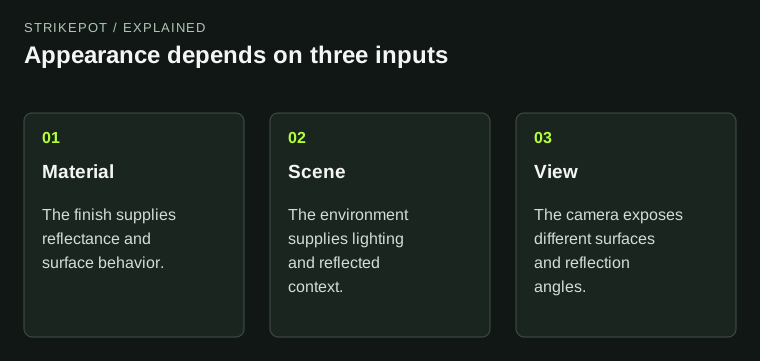
Match these inputs before attributing a screenshot difference to the skin itself.
The texture is not the final picture
Valve's finish documentation describes CS2's physically based rendering and the use of albedo to represent a surface's reflectance. In practical terms, an artist supplies material information that the game renders under a scene's light. The final screen color is not simply a pasted copy of the source image.
Think of a hypothetical blue metal panel. Under one environment, its broad base color may dominate. At another angle, a bright reflection may cover much of the panel. Sampling a single pixel from each image would measure two different rendered circumstances, not necessarily two different blue materials.
The same reasoning applies to perceived contrast. A dark accent against a bright background can look stronger than the identical accent against a shadowed scene. Your eye judges relationships across the whole frame, so the surroundings are part of the comparison even when you only care about the weapon.
View angle can change which feature you are seeing
Moving the camera changes more than the outline of the object. A surface that looked broad and easy to read may become narrow. Reflections can move, and a curved part can show several lighting responses at once. A small change in pose may therefore affect the apparent color of a large region.
For a useful comparison, identify a specific surface and keep it similarly oriented. “The receiver looks brighter” is more testable than “the whole skin is better.” Compare a broad region as well as its brightest highlight so one small reflection does not stand in for the entire material.
Also distinguish reflected brightness from painted detail. A sharp light patch can resemble a pale graphic in a still image. Seeing the same surface from another angle helps determine whether the patch belongs to the design or the rendering conditions.
The inspect background is part of the setup
Valve's February 2024 notes introduced separate inspect and main-menu background settings. That is a documented reason to record the inspect environment rather than assuming every inventory capture uses the same scene.
When someone supplies two images, ask whether they were made in comparable contexts before using them as a before-and-after pair. A cropped picture may omit exactly the background information needed to answer that question. Retaining the uncropped original can be more valuable than increasing the crop's resolution.
For creators, use a stable review scene while comparing revisions. Then inspect additional environments to check whether the design remains coherent. The stable scene isolates changes; the varied scenes reveal weaknesses. Those are complementary tasks.
A controlled comparison starts with one question
Choose the claim you want to examine. Perhaps a particular panel seems more reflective, a painted accent seems less saturated, or a sticker's effect is difficult to see. Use the same item, comparable pose and same scene while checking that feature.
- Keep the item reference and the exact surface being compared.
- Match the inspect environment and general camera orientation.
- Retain an uncropped capture so the setup remains visible.
- Change one relevant condition and describe what changes.
- Repeat from another angle if a reflection could explain the result.
This is a proposed observation method, not a claim that we tested a particular finish. It helps distinguish a repeatable material response from a flattering one-off frame. It does not measure how a skin will appear on every display.
Do not use lighting to explain unrelated identity differences
A missing motif, different attachment or different surface layout may require an item check. Match the weapon, finish and individual properties before investigating subtle rendering differences. The float and pattern guide explains those separate identity fields.
Imagine that one picture shows a large red shape near the rear of the weapon while another shows it near the front. Lighting may alter its brightness, but that alone does not explain its placement. The comparison first needs to establish whether the same application is being shown.
Likewise, post-processing can complicate the evidence. A promotional image may have a valid artistic purpose while being unsuitable for a precise color comparison. Keep it as a presentation reference and seek a game capture for the material question.
Keep the comparison question small enough for the images to answer. Testing whether one reflective band moves across a panel requires less evidence than proving that a whole finish changed in every environment. Once the narrow behavior is understood, you can decide whether a broader review is justified. This avoids turning a single striking frame into a claim about the entire rendering system.
State the result at the level you observed
A useful observation sounds like this: in the same inspect scene, the highlight crosses this panel differently when the view rotates. That statement describes a repeatable relationship. It is stronger than declaring that one screenshot proves a universal color.
For a purchase, use the exact-item inspection workflow after making the visual comparison. For a creator review, preserve the material version and capture setup alongside the image. The goal is to make the next comparison more informative, not to choose a single screenshot as the only authentic appearance.