
A useful Workshop presentation lets someone understand what your CS2 finish is, how it looks in the game and which version of the work they are reviewing. A dramatic promotional image can attract attention, but it cannot answer all of those questions by itself.
Build the presentation as an explanation of the design. Each image should show a different relevant property, and the text should connect the concept to what the images actually demonstrate.
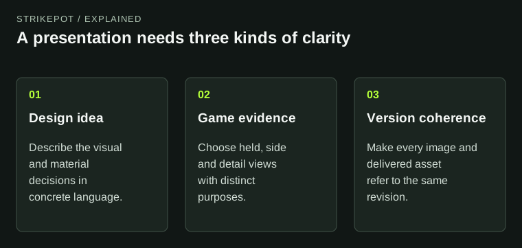
A beautiful cover attracts attention; the evidence set makes the work understandable.
Lead with a clear account of the idea
Describe the finish in one or two concrete sentences. Name the original visual idea, the receiving weapon and the material relationship. For a hypothetical design, that might be an illustrated night garden using a quiet painted background and a small reflective accent.
A description built only from praise gives the reviewer little to inspect. Words such as beautiful, premium or unique do not explain where the focal point is or why a material was chosen. Replace them with the decisions that make the work recognizable.
Keep the scope honest. If the presentation shows a proposal, call it a proposal. If several weapon applications are shown, identify whether they are separate finished applications or exploratory variants. The Workshop status guide explains why a published page is distinct from official release.
Choose images by the question they answer
Valve's presentation guidance calls for plain game views and separately allows promotional imagery. Use that distinction to build a compact evidence set rather than a long sequence of near-duplicate beauty shots.
The held view should show how the main idea reads during ordinary use. A side view can explain the full illustration. An inspect angle can reveal a material boundary, an upper surface or a detail that the other images conceal. A close-up should answer a specific question that remains after those views.
For the fictional night garden, one image might establish the recognizable plant silhouette. Another might show how the illustration wraps a panel. A third might demonstrate the reflective accent. If all three only repeat the same attractive side, replace two with more informative views.
Keep the actual rendering evidence plain
When you want to demonstrate the in-game appearance, avoid alterations that make the result impossible to compare with the current preview. A different background or graphic frame can have a presentation purpose, but a color treatment applied over the weapon changes the evidence.
Retain the unedited originals of your game captures. They preserve context if a collaborator later asks whether a bright region is part of the finish or a reflection. Cropped detail images can sit beside those originals, with their purpose made clear.
The current Item Editor documentation separates inspection and preview functions. Use the views that answer the review question rather than forcing every explanation into a single screenshot format.
Show behavior when behavior is part of the design
If the concept depends on a material contrast, show enough views for that contrast to be understood. If changing wear is central to the artwork, show representative states with comparable framing. Do not make the reader infer a whole progression from one pristine image.
A short labeled sequence can be more informative than an elaborate collage. Keep the same receiving weapon and clearly identify the version. If both the artwork and the wear state change between panels, the sequence no longer isolates the behavior you meant to demonstrate.
Choose examples that reveal the design rather than only protect it from criticism. A weak angle is useful working information. Resolve the weakness where possible; if it is an inherent limitation, avoid presenting one carefully selected pose as the complete experience.
Connect the images to a consistent asset package
A presentation is hard to trust when its parts show different revisions. Use a version name that connects the source artwork, finish definition and selected captures. Keep the final review files separate from earlier exports without discarding the development history.
Imagine that a collaborator adjusts the garden's focal shape after the side image has been captured. The held view now shows a different arrangement. Both images may look good, but together they explain no single version of the finish. Replace the outdated image before treating the presentation as complete.
The official model resources help establish the receiving geometry, but your own package still needs that version discipline. A source reference cannot reconcile inconsistent exports.
If a contact sheet is useful, give every panel a short descriptive label such as held view, upper surface or worn preview. Avoid labels that tell the reviewer what to think. An image marked best angle supplies less useful context than one that identifies the view and material state. Keep the individual originals available so the small sheet does not become the only evidence.
Ask for feedback someone can give
Invite comments on a concrete uncertainty. Does the central silhouette remain recognizable in hand? Does the metallic accent distract from the illustration? Is the upper surface too empty? These questions produce more useful feedback than asking whether the whole submission is good.
Then retain the observations that relate to the work. One viewer may prefer a quieter palette; another may prefer a louder one. Preference disagreement does not necessarily identify a technical failure. A feature hidden in every normal view is a more specific problem.
Players can apply the individual inspection guide to an issued item, but a creator presentation has an earlier job: make the proposal reviewable. Finish when the concept, game views and asset version tell the same story. The promotional image can then celebrate a design the evidence already explains.