
A weapon illustration should be designed around the view in which players will actually spend time with it. A striking side profile is useful, but it can hide a weak upper surface, place the main feature behind a hand or depend on an inspect pose that is only briefly visible.
The solution is not to abandon side-view art. Give each view a purpose. Let the held view communicate the design's identity, then use the inspection view to reveal details and relationships that reward a closer look.
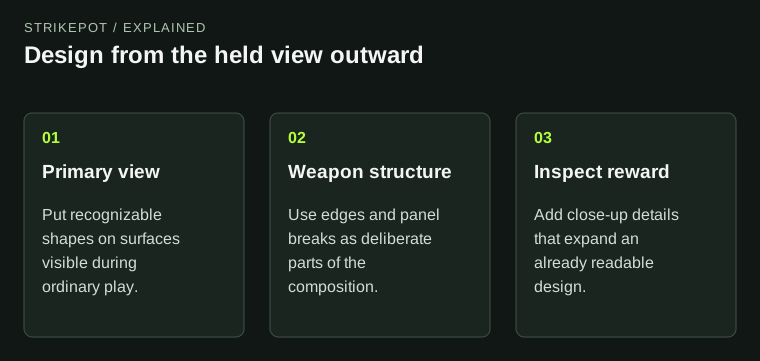
Each viewing context has a different role in the same artwork.
Map visible space before drawing the main feature
Begin with the receiving weapon rather than an empty rectangle. Mark the surfaces visible in the normal held pose, the surfaces partly covered by hands and the areas that turn away from the camera. Valve provides CS2 weapon geometry as a reference. Use the actual shape to identify your available canvas.
Imagine an original bird illustration intended for a long receiver. A side view may suggest placing the eye near the center. In hand, that center might angle away while the top edge remains prominent. The question becomes whether the eye should move, whether the bird can be recognized from a different feature, or whether the concept needs another weapon.
Those are design choices, not defects in the illustration. Solving them early is cheaper than painting a highly finished image and discovering that its most important part is hidden.
Build a hierarchy that survives a small view
Separate the large shapes from the small details. A broad color relationship or distinctive contour can identify the finish before a viewer reads thin line work. Tiny motifs can then provide a second layer for inspection rather than carrying the whole concept.
Try a simple review: reduce a captured view until it resembles the amount of space the weapon occupies during play. Describe what remains recognizable. If the answer is only “many bright marks,” the illustration may need a clearer hierarchy. Enlarging every detail is unlikely to solve the problem because the elements will still compete.
In our hypothetical bird design, the wing might form the large readable shape, the head might become a medium detail and feather marks might remain close-up rewards. That arrangement is an editorial example, not a recipe Valve promises to select.
Let the weapon participate in the composition
Valve's style guidance encourages illustrations that feel designed for the weapon. Think about how a curve, panel break or long edge can become part of the image instead of an obstacle beneath it.
A narrow surface might carry a continuation of a wing rather than a compressed copy of the whole bird. A natural break between parts might divide a decorative frame. An exposed strip could act as a quiet border. These decisions make the artwork respond to the object without requiring the weapon's silhouette to change.
Be careful with literal alignments. A painted circle that is meant to frame a model feature can become distracting if it sits slightly off center. A busy graphic crossing several separate parts may also look accidental when viewed from a new angle. Check the relationship in three dimensions before polishing it further.
Use inspection to add a second reading
The best close-up details often deepen an idea that already works from the main view. A hidden continuation, small original symbol or controlled material contrast can make inspection rewarding. It should not be necessary to pause at one precise angle just to understand what the design is.
For a useful comparison, capture the same version in hand, from the side and from an angle that exposes the top. Write one sentence about what each view contributes. If two images repeat the same information, replace one with a genuinely different surface. If a view exposes a problem, keep it in the working review rather than excluding it from the evidence.
Readers comparing an existing skin can borrow the same approach through the inspection guide. A layout you enjoy in a large promotional image may feel different when it is reduced to its ordinary place on the screen.
Check the composition under the intended controls
Viewmodel preferences affect how much of a weapon occupies the screen and how the player experiences its surfaces. Keep those conditions consistent while reviewing versions. The hand preference guide covers the game's side controls; it is useful context when a composition was judged from only one personal setup.
Do not respond to a preference difference by promising that every setup produces an identical view. Instead, record the view used for the main comparison and add another supported perspective if it meaningfully changes the reading. The aim is to understand the design's robustness, not to remove every difference between players.
Also check the role of attached decorations. A sticker or charm can cover or compete with a focal area. You do not need to design around every imaginable craft, but you should know which parts of the base finish carry its identity before attachments are added.
End with a decision about the artwork
A review should produce a concrete next step: move the focal feature, simplify a cluster of detail, make the upper surface intentional or keep the composition because it already reads well. “Needs more polish” is too vague to direct the work.
Preserve the previous version and compare the change using the same poses. That small discipline keeps the design tied to how it will be experienced. A strong finish can reward both ordinary play and deliberate inspection, with each view showing a different part of the same coherent idea.