
A Gunsmith finish in CS2 combines painted artwork and patinated material behavior on one weapon. That makes it useful for a design that needs both an illustration and a visibly different metal treatment. It also creates an extra responsibility: the two surfaces should feel like parts of one object rather than unrelated effects competing for attention.
The strongest starting question is therefore not how much shine to add. Ask why the weapon needs two treatments and which part of the design each treatment supports.
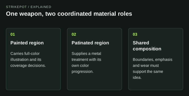
A hybrid succeeds through the relationship between its regions, not simply their presence.
Give the two materials different jobs
Imagine an original design with painted botanical shapes on broad panels and a quieter metallic frame around them. The painted region carries the illustration. The metallic region supplies structure and contrast. That division gives the viewer a reason to notice the difference.
If both regions use equally busy patterns, bright accents and strong surface detail, the distinction may become harder to read. More technical variety does not necessarily produce a richer composition. You need hierarchy across the whole weapon, not just within each texture.
Write one sentence for each material's role before authoring detailed maps. If those sentences are indistinguishable, consider whether a single coherent treatment would communicate the idea more clearly.
The receiving weapon helps define the division
Valve's Gunsmith reference describes a combination of Patina and Custom Paint with prepared regions determining their application. The receiving model is therefore part of the design system. You are not decorating an unlimited blank surface.
Use a diagnostic preview to identify the relevant boundaries. Look at broad panels, narrow components and the portions visible in hand. An idea that requires its main painted feature on a metal-treated region may need to change its layout or be reconsidered for the selected application.
That constraint can be productive. A boundary might frame an illustration, separate a focal area from a supporting component or emphasize how the weapon is assembled. It becomes a problem when the artwork ignores it and the final result looks accidentally interrupted.
Unify color without making the surfaces identical
A hybrid does not need the same palette everywhere. It needs a relationship that can be read. A warm metallic accent might support a cool painted field through controlled contrast. A shared secondary tone might connect the two without flattening their material differences.
Valve's Patina documentation assigns colors to different treatment states, while Custom Paint carries full-color artwork. That means the artist is coordinating two different kinds of color logic.
For the hypothetical botanical finish, compare the leaf colors with both the newer and aged metal appearance. A palette that harmonizes only in the clean preview may produce an unintended clash elsewhere. Do not reserve all the color decisions for the illustrated part.
Read channels in their local material context
In a hybrid system, the role of technical data can depend on which material region is using it. Valve's Gunsmith reference describes different alpha-channel functions in the patinated and painted portions. That is a reason to keep a clear channel plan, not to assume alpha always means transparency.
Before copying a map from another finish, identify what each part of the file is meant to control. A value created to alter one material behavior may be inappropriate for another. Current editor support and documentation should govern the workflow; older sample parameters are not a universal CS2 recipe.
A useful working note can be plain: this region controls the metal response; this region controls paint coverage; this feature must remain readable. The note should explain the design purpose as well as the file role, so another collaborator can understand why the data exists.
Review wear as a relationship between materials
Check whether the painted and patinated regions remain related through representative states. The painted illustration might lose small areas while the surrounding metal shifts in tone. Those changes can reinforce the design if they were considered together.
They can also expose an unresolved composition. Perhaps the metal becomes the brightest region exactly when the painted focal point becomes quieter. The viewer's attention moves to a component that was never designed to carry it. That is a hierarchy problem, not merely a complaint that the finish looks worn.
For an issued item, use the wear and pattern guide to preserve its actual properties and compare the visible surfaces. Material-family knowledge explains possible behavior; it does not establish the condition of a specific copy.
Give a focal boundary a dedicated close-up only when it reveals something the normal views cannot. A hybrid design should not need an explanatory arrow on every panel to make its division understandable. If the distinction remains confusing at ordinary size, simplify the neighboring shapes or contrast before adding another layer of material detail.
Check boundaries in motion and at playing size
A boundary that looks clean in a side render may feel awkward as a reflection passes over it. Rotate the weapon and follow the transition. Then review the held view at ordinary size. The hybrid should remain understandable without requiring the viewer to study a giant close-up.
The inspection guide helps owners evaluate those views. Creators should preserve the design version as well, so a comparison between materials is not accidentally a comparison between different exports.
Choose Gunsmith when the divided material logic adds something the idea needs. Once the painted image, metal treatment, boundaries and changing appearance all support the same concept, the hybrid feels intentional. The presence of two techniques becomes part of the design's meaning rather than a feature list attached to it.