
A Rust skin can be attractive artwork and still be a poor fit for the item it covers. Players need to recognize equipment quickly, often from a partial view or while moving. The skin-acceptance guidance treats those gameplay cues as part of the design problem.
The useful question for an artist is therefore broader than “Does this look impressive?” Ask whether the treatment still communicates the base item, whether its meaning survives without a caption and whether the preview accurately represents the finished work.
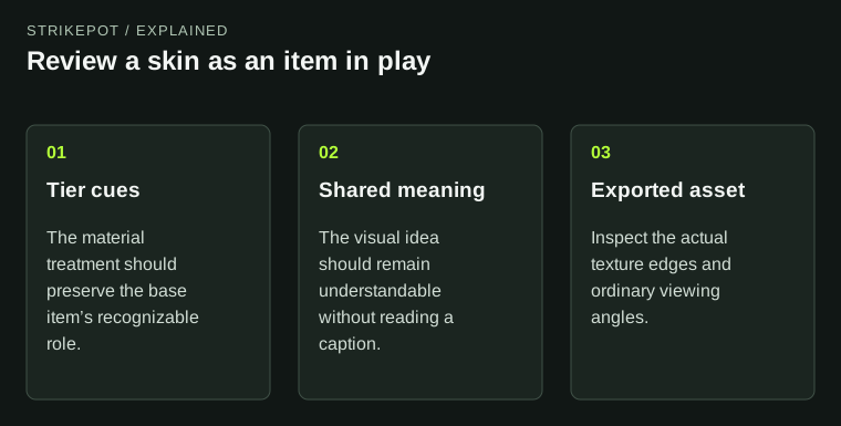
The conceptual art review focuses on recognition and presentation, without reproducing any real skin.
Materials communicate a tier
The Facepunch-hosted acceptance page warns against making an early clothing item appear to belong to a different material or armor tier. It also discusses fitting Rust's worn visual language. These are published design considerations, rather than a formula guaranteeing acceptance.
A material cue carries information. Seams, fabric folds, plates and fasteners can suggest what an object is made from before the viewer reads its name. When the artwork gives those cues a conflicting meaning, the result can be difficult to interpret during play.
Consider a hypothetical cloth garment painted to resemble thick metal panels. As a flat illustration, the effect might be convincing. On the original clothing model, that same effect could imply protection the base item does not visually represent. The design issue is the mismatch between recognition and treatment; this example is not a claim that a particular published skin changes damage statistics.
Judge the item at the distance where it will be read
A large preview rewards small details. Gameplay frequently presents a smaller object, an unusual angle or only part of a silhouette. Review your concept under those conditions before deciding that every detail contributes.
A useful self-review has several views: the whole item at a normal scale, a closer view of the important treatment, and an angle that might expose a weak or ambiguous area. Keep the base item obvious in each. This is a proposed review method, not a set of mandatory screenshot dimensions.
For a weapon concept, ask what a viewer can recognize when most of the decoration is hidden by the usual viewing angle. For a container, ask whether its distinguishing symbol still works when the object is seen among neighboring storage. These questions can produce more useful revisions than adding detail everywhere.
Let symbols carry meaning across languages
The acceptance guidance also cautions that Rust is played internationally and that wording cannot simply be localized inside an image. Its practical lesson is that text should not be the only way to understand a design.
Imagine a fictional storage theme intended for medical supplies. A composition that relies entirely on an English sentence can lose its purpose for someone who cannot read it. A clearly developed visual theme can remain understandable while any lettering supplies secondary detail.
This does not imply that every word is forbidden or that one symbol has a universal meaning. Review the whole composition. If removing the caption makes the design incomprehensible, the artwork may need stronger visual communication before the wording is polished.
Originality includes the source material
The same guidance identifies rights to artwork as a selection concern. Before building a concept around a recognizable logo, celebrity photograph or asset from another game, establish that you have the appropriate permission. Familiar imagery being easy to find online does not make it your original material.
For an artist, provenance is part of keeping the project manageable. Maintain your own working files and a record of licensed inputs where relevant. If you cannot explain where a central image came from, replacing that element early may save a substantial redesign later.
Distinctiveness also needs more than changing a color. Ask what your concept contributes to the item family: a coherent visual idea, a different composition or a treatment suited to a neglected surface. Do not infer acceptance chances from a claim that a certain theme is “due” for release.
Texture edges can undermine an otherwise clear design
Technical presentation matters because the game renders textures under conditions different from a flat editing canvas. The transparent-PNG reference describes how hidden color behind transparent pixels can bleed through filtering and mipmaps, producing unwanted bright edges.
That is a narrow, documented example of a broader review habit: examine the exported asset, not only the layered working file. If an edge looks correct in the editor but breaks in the intended preview, identify the export or rendering issue before disguising it with more artwork.
The reference discusses a particular editing workflow and is marked as old. It does not establish that every current exporter has the same behavior. Check the output you actually produce; there is no need to install an unrelated utility merely because it appears in a historical tutorial.
Show the result honestly, then make a design decision
Use a preview that helps viewers assess the skin itself. Decorative backgrounds can establish a theme, but they should not hide problematic materials, unfinished surfaces or an appearance that depends on one favorable angle. Identify mockups and concepts clearly.
If you are reviewing an already released cosmetic, separate its artwork from your ability to apply it. The reskinning guide deals with owned appearances and object state. The DLC crafting guide addresses pack and base-recipe selection. A striking preview cannot answer either entitlement question.
The hosted acceptance page is historical guidance, and modern releases can show exceptions to its stylistic preferences. Use it to understand the problems an editor considers, then inspect the current submission tools and requirements. The strongest revision is one you can explain: it clarifies the item's identity, improves the exported result or makes the concept understandable to more players.