
A camouflage pattern does not identify one universal CS2 material. Spray-Paint and Hydrographic finishes can both use limited-color patterns, yet they describe different ways of applying and wearing the decoration. One behaves like layered stencil paint; the other treats the prepared parts as surfaces receiving a transferred pattern.
For an artist, the style choice should follow the intended material story. For a player, that distinction explains why two patterned finishes can change differently as their visible condition changes.
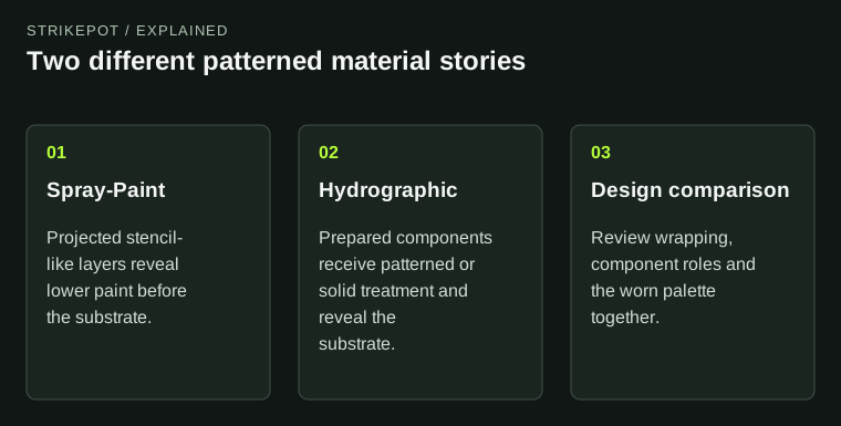
The source motif can be similar while the material behavior and finished composition differ.
Begin with the imagined process
Suppose you are designing an original pattern of broken branches. Ask how those branches reached the weapon. Were several stencils sprayed over an assembled object, or were individual parts given a patterned treatment before assembly? The answer suggests different relationships between the pattern and the weapon's structure.
This is a design model, not a claim that an inventory skin was manufactured in a real workshop. The purpose is to make the rendered treatment coherent. If the imagined process and visible application disagree, the material can feel arbitrary even when the pattern itself is attractive.
A broad all-over field may suit the first idea. A finish that deliberately contrasts patterned panels with quiet solid components may suit the second. These are starting points to evaluate, not rules that exclude creative exceptions.
Spray-Paint treats wear as a layered reading
Valve's Spray-Paint reference describes triplanar application and successive wear through paint layers before the substrate appears. That gives the artist a reason to think about the order of the colors, not only their clean-state arrangement.
For the hypothetical branch pattern, imagine a dark base with lighter stencil marks and a small accent layer. As the presentation changes, the visual balance can shift because upper and lower layers contribute differently. A color that feels secondary in the clean preview may become more prominent later.
Review the palette as a sequence. Do the revealed relationships still belong together? If the worn result seems muddy, adding contrast only to the pristine preview may miss the problem. The layered states deserve their own composition review.
Hydrographic application makes component roles important
The Hydrographic reference describes application through the weapon's original UVs, with prepared regions determining patterned and solid areas. It also describes wear exposing the substrate directly. These are meaningful differences from a layered stencil treatment.
A creator should inspect where the pattern starts and stops on each component. A deliberate solid region can frame the motif or give the eye a resting place. A pattern that unexpectedly ends halfway through a focal feature may instead look unresolved.
In the imagined branch design, the receiver might carry the pattern while selected components provide a calm solid contrast. The family resemblance comes from the palette and motif; the object remains readable because not every part competes equally for attention.
The same source pattern is not the same final design
It can be useful to try one original pattern in two supported styles as a development comparison. Keep the palette and receiving weapon comparable, then examine the differences in wrapping, component coverage and worn presentation.
Do not assume that changing a style is merely changing a label. The finished object results from the pattern, its application and its material behavior together. If one version requires a different scale or a revised accent distribution, that is part of adapting the design.
Also avoid treating the experiment as a promise of two official items. The Workshop guide explains why a preview or submission does not establish release. The exercise produces information about your work, not an entitlement to a future collection slot.
Use a comparison with specific observations
| Review question | What to observe |
|---|---|
| How does the pattern cross surfaces? | Follow one recognizable motif around a panel turn |
| Which components carry decoration? | Compare patterned, solid and exposed regions |
| What changes with wear? | Track layer relationships and substrate exposure |
| Does the intended process still read? | Judge the whole object in hand, not one isolated patch |
The table avoids a false universal winner. A style is useful when it supports the specific idea. A visually restrained hydrographic treatment can be more coherent than a complicated sprayed one, and the opposite can also be true.
For an issued object, use the individual wear and pattern checks. A style explanation is background for interpreting the surface; it does not tell you the exact state of the copy in front of you.
Keep a plain palette sheet beside the material comparison. Label which colors are intended to dominate and which should remain supporting accents. If the layer relationships reverse that hierarchy, you can revise the palette deliberately instead of adding more shapes to compensate. The exercise also helps explain why one source pattern can produce two quite different designs: color order, exposed areas and component roles change how the viewer groups the same marks. Those differences belong in the design decision, even before fine detail is considered.
Choose the version whose logic survives inspection
Compare the normal held view, a side view and a representative worn preview. Name the material story you perceive in each. If the imagined application is only convincing in one flattering image, identify what breaks elsewhere before adding more detail.
The final choice may require changes to the artwork as well as the settings. A design built around layered paint needs color relationships that work through those layers. A design built around patterned components needs boundaries that feel deliberate. Thinking through that relationship produces a stronger finish than selecting a style solely because its clean preview looks shinier or more intricate.