
A CS2 Patina finish is not simply a painted picture with scratches removed. Its construction includes colors associated with the underlying metal, the newer treatment, the aged treatment and material accumulated in recesses. As its presentation changes, the relationship between those colors helps tell the visual story.
That distinction is useful when a metallic skin becomes darker or changes its apparent palette. Looking only for missing paint can overlook the material behavior the finish was designed to represent.
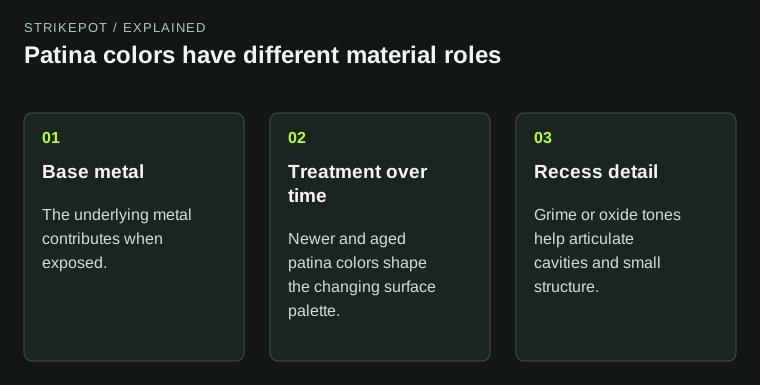
The palette describes related material states rather than four arbitrary paint colors.
Read the palette as a set of material roles
Valve's Patina reference identifies four color roles alongside the full-color image. Rather than treating them as four interchangeable swatches, think about what each contributes to the object's appearance: exposed metal, the fresher treatment, its aged state and the material in cavities.
Imagine an original finish built around warm bronze-like tones and cool green accents. The clean presentation might emphasize one balance; the aged presentation might emphasize another. A scratch can introduce a different metal color rather than simply erase part of a flat illustration.
This is a hypothetical palette study, not an identification of any named skin's internal parameters. To describe an issued item, use its actual appearance and documented identity. The conceptual model explains what an artist can be planning; it does not reveal every setting from a screenshot.
Paint and patina ask different design questions
In a painted illustration, an important concern can be whether the graphic survives as the underlying surface becomes visible. Valve's Custom Paint reference describes that route. The artwork carries a picture, and wear can interrupt it.
With Patina, the changing material palette can itself be the picture's subject. A broad mottled field, color contrast in recesses or subtle metal treatment may remain interesting without a large illustrative symbol. The viewer is reading a material surface rather than only a printed graphic.
Neither approach is more authentic or more artistic by default. A painted design can be subtle and a patina can be visually intense. The useful difference is the role assigned to color and material change.
Design the relationship between states
Review the newer and aged appearances as related compositions. Do the colors still belong to one idea? Does the underlying metal provide an intentional contrast? Do cavities become useful structure or distracting patches?
For the imagined warm-and-cool finish, a creator might decide that the cooler color should remain secondary so the weapon retains a warm identity. Another concept might deliberately reverse that balance with age. Both can be coherent if the choice is clear and the transitions support it.
A weak progression often reveals a decision that was postponed. The clean preview was polished, while the aged colors were chosen only to complete the parameter list. Give every material role a reason instead of assuming that the attractive initial palette will solve the later states automatically.
Do not use one number to describe the whole surface
A wear value is useful item information, but it is not a complete visual description of a material. Two finishes can use wear differently, and a surface's most interesting feature may be color relationship rather than the amount of pristine artwork remaining.
When comparing actual copies, choose the regions you care about: a broad visible panel, an edge exposing the underlying treatment and a recess showing darker accumulation. Describe each before making a general judgment about the whole weapon.
The float and pattern guide covers the corresponding item fields and comparison workflow. Keep those fields with the item, but let the surface inspection answer the aesthetic question. A material explanation should not be used to override the actual exterior label or invent a pattern premium.
Let the weapon's structure organize the effect
Material variation becomes easier to read when it relates to the object's form. A change near a recess can reinforce depth; a broad treatment on a panel can emphasize its area; restrained surrounding components can make a colored region feel deliberate.
Inspect the design from the held view as well as a large side image. Fine material variation can become a single blended tone when reduced. That may be desirable for a quiet finish, or it may mean the intended contrast needs a clearer hierarchy.
Also check whether a bright reflection is obscuring your evaluation. A metallic surface can look very different as the view changes. Compare representative angles before repainting an area that only looks wrong under one highlight.
A short written color study can help preserve the intention. Describe the exposed metal as warm or cool, explain what the aged treatment should emphasize and identify which cavity tones should remain secondary. These notes need not replace swatches. They explain why the swatches were chosen, making later revisions easier to judge than a collection of unlabeled color values.
Describe the result without inventing a history
A patinated-looking weapon communicates an artistic treatment. Its visible state is not evidence that the digital item spent a corresponding length of time in play or underwent a real chemical process. Keep the material metaphor separate from a claim about the item's personal history.
For creators, show the intended range with clear previews and preserve the source palette choices. The Workshop status guide keeps those previews distinct from released inventory items.
For players, ask a concrete question: which metal colors and surface relationships do I enjoy in the views I will use? That produces a more useful comparison than ranking every metallic finish by how closely it resembles unscratched paint. Patina has its own visual grammar, and understanding that grammar makes the design easier to read.