
A seamless pattern does more than hide the edge of a square. It should remain convincing when the square repeats, when the application shifts and when a differently sized weapon carries the same design. A technically matched border can still produce an obvious grid, awkward clusters or motifs too small to recognize.
Develop the pattern at two levels: continuity across the tile boundary and visual rhythm across a larger field. Then check the field on the actual receiving weapon.
A border can be seamless while the repeated composition still needs work.
A matching edge is only the first test
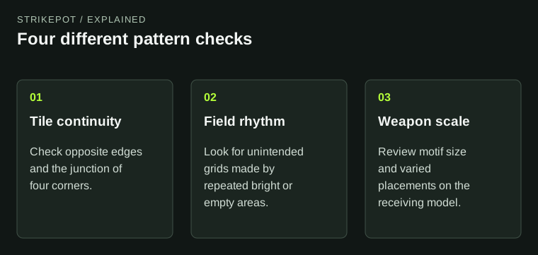
Start with a repeated preview containing several copies of the source tile. Look across the joins rather than staring at one square. A line leaving one edge should meet its intended continuation. A shape cut at a corner should not create a bright lump when four corners meet.
Then step back. Can you see the repeated square even though no individual edge is broken? A large empty patch or bright central object can reveal the grid through repetition. The tile is continuous but visually repetitive in an unintended way.
Consider an imaginary pattern of original leaves. If every tile places the largest leaf in the middle, the repeated field can become a regimented array of large leaves surrounded by smaller filler. Moving or varying the main masses can make the pattern feel more organic without adding more detail.
Design the rhythm before hiding it on a weapon
A long weapon surface can expose repetition in a different way from a compact pistol panel. On one model, the viewer may see several repeated shapes in a line. On another, only one recognizable fragment appears. Neither view is well represented by a flat square displayed alone.
Plan broad, medium and small features. Broad features create the overall rhythm; medium features supply recognizable motifs; small features keep close inspection interesting. If all three operate at the same size, the result can look like visual noise when reduced.
This hierarchy is an art recommendation rather than a game rule. The right balance depends on the intended design. A deliberately regular industrial pattern can embrace repetition, while an organic camouflage may need to disguise it. The point is to choose that behavior rather than discover it accidentally.
Scale changes what the pattern means
Valve's pattern-scale documentation explains that differently sized weapons need adjustments to maintain an appropriate application. For an artist, the practical question is what a motif becomes after scaling.
A broad stripe can become a narrow line. A small emblem can become an unreadable dot. Enlarging a texture can also turn a subtle surface treatment into a dominant illustration. The source drawing has not changed, but its role on the weapon has.
Choose a representative receiving surface and set a clear target. For our hypothetical leaves, perhaps one medium leaf should remain recognizable in the held view while the smaller shapes blend into a texture. That goal is more useful than preserving one numeric setting across every model.
Test shifts and rotations as part of the design
A tile that looks excellent at one placement can fail when moved. A narrow blank corridor may cross the most visible panel; the only distinctive motif may disappear behind a hand; or repeated lines may align with a model edge in an awkward way.
Valve's randomization explanation establishes that allowed offset and rotation ranges participate in application. Review representative positions across the range you intend to permit. Do not select one flattering preview and assume it represents every application.
If text or a directional symbol is part of the pattern, ask whether it still makes sense under the allowed rotations. A design that relies on a word remaining upright needs different planning from scattered abstract shapes. Wider variation is not automatically better; it must suit the idea.
Keep technical continuity and composition separate
| Problem | Useful review |
|---|---|
| A visible join | Inspect matching tile edges and corners |
| A repeated square pattern | Review mass, spacing and contrast across several tiles |
| A motif becomes unreadable | Compare its size in the normal held view |
| One application looks empty | Check the allowed placement range on the model |
Each diagnosis suggests a different revision. Adding tiny detail will not fix a broken border, and smoothing a border will not fix a giant repeated bright patch. Keeping the problems separate makes iteration faster and more understandable.
The existing individual pattern guide helps readers interpret an issued copy. The creator's task comes earlier: build a source pattern whose permitted applications all support the intended idea.
Check the corners independently from the horizontal and vertical joins. A small bright mark touching two borders can become a much larger shape where four tiles meet, even when each pair of edges appears continuous. Likewise, a directional motif can create an unintended diagonal marching across the repeated field. Look for those larger relationships before adding fine texture. They are often easier to revise while the pattern is still a collection of simple shapes.
Preserve a compact review set
Keep one repeated flat field, one ordinary held view and a few deliberately different applications. Label the version and explain the remaining weakness. A compact set of useful evidence is easier to compare than dozens of nearly identical screenshots.
Valve's style guidance treats seamless construction as a design expectation, but no texture exercise guarantees selection. The Workshop guide explains that separate release boundary.
Move forward when the joins, rhythm, motif size and permitted variation work together. A good repeating pattern feels intentional at the scale of both the source tile and the weapon carrying it.