
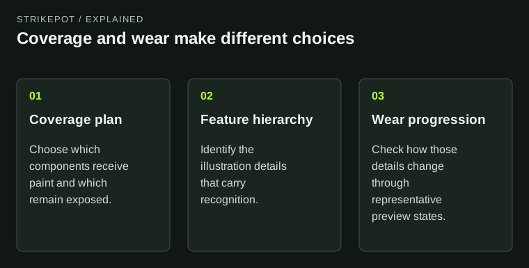
The worn appearance of a CS2 finish is partly a design problem. An artist can plan which areas receive paint, which underlying surfaces remain exposed and which important parts of an illustration should survive longer. A wear value then operates within that constructed material system; it is not the whole explanation for what disappears.
For creators, the aim is a coherent progression rather than one beautiful pristine preview followed by accidental damage. Decide what the viewer should still recognize as the finish changes.
A bare surface can be intentional from the start or revealed through wear; the design should distinguish them.
Separate coverage from durability
Coverage asks whether a surface receives the finish. Durability asks how the applied finish responds to wear. Those questions can produce similar-looking bare areas in one screenshot, but their design intentions differ.
Valve's masking documentation describes prepared weapon information and supported alpha-channel controls that influence how the underlying substrate is revealed. The substrate is the material beneath the finish. Keeping that layer in mind helps you judge the whole object rather than only the colorful image.
Imagine a hypothetical illustrated weapon with an intentionally unpainted grip. That bare grip can provide a quiet visual base from the start. A scratch passing through the illustration is a different event in the material design. Calling both areas “missing paint” hides the distinction you need to review.
Identify what carries the illustration
Before adjusting durability, mark the features that make the design recognizable. A character's eyes may be essential; a decorative border may be expendable; a field of tiny marks may look better when interrupted. The decision should come from the illustration's hierarchy.
Valve's worked example uses that reasoning: it treats unpainted components separately from a graphic feature whose readability needs protection. The useful lesson is not to copy a particular mask. It is to decide which visual relationships are doing important work.
For our imaginary design, a broad silhouette might preserve recognition better than protecting every small line. If the whole image is made equally resistant, the surface may lose the variation that makes the worn presentation interesting. Preservation should be selective and purposeful.
Design a progression, not one extreme
Review a few representative wear states as a sequence. At the clean end, check whether the composition is balanced. In the middle, check which features begin to fragment. At the more worn end, check whether the remaining shapes still look deliberate.
You do not need to pretend that one preview stands for every possible issued copy. The development question is whether the intended behavior is robust enough to support the design. A sequence reveals failures that a single before-and-after pair can miss, such as an awkward intermediate state where only half a face remains legible.
Write a short expectation for each state. Perhaps the border becomes broken, the background grows quieter and the main symbol remains recognizable. Then compare the actual preview with that expectation. This gives revision a target beyond making the item look universally cleaner.
Use the receiving surface as part of the artwork
A design does not have to paint every available component. Leaving a material exposed can create contrast, frame the main illustration or make the weapon's construction easier to read. An unpainted area is a composition choice when it has a clear relationship to the rest of the object.
Try temporarily removing a secondary region from the imagined finish. Does the main design become clearer, or does the object feel unfinished? The answer depends on the visual balance, not on how much surface area is covered. More coverage is not automatically more complete artwork.
Valve's Custom Paint reference identifies support for masking and durability, but the exact channel conventions belong to the selected style. Read those conventions before moving a mask from another project. The word alpha does not establish one universal behavior across every material.
Keep accidental breakage distinct from intended wear
If an illustration splits at a model boundary in every preview, investigate the layout before changing durability. If an important feature vanishes as wear changes, investigate the wear design. If a highlight hides the feature only from one angle, investigate the material and scene.
These diagnoses can look similar in a still image. Use controlled comparisons to separate them. Keep the same model and scene while changing the relevant state, then record the first point at which the design stops communicating its idea.
For owners, the float and pattern guide explains how to compare an actual item's fields and visible surfaces. This creator discussion does not replace those checks or reinterpret a live item's exterior label.
Compare two equally important features before protecting either one. If one already sits on a visually quiet area while the other crosses a conspicuous boundary, making both equally persistent may create an imbalance. A stronger solution could move the vulnerable feature or simplify its shape before adding durability control. Technical preservation is one tool in the composition, not the only way to keep an idea readable.
Show the intended worn design honestly
A submission should make its behavior understandable, including the states that are less flattering. Keep the same general views across the review sequence so changes in pose do not conceal changes in the artwork. State which images are previews rather than issued inventory objects.
The Workshop status guide explains that separate distinction. A technically complete worn preview is still part of a proposal until official release.
The strongest outcome is a finish whose covered areas, exposed substrate and surviving illustration feel related. The artist is not merely protecting a pristine picture from damage; the artist is designing how the picture remains meaningful as its material presentation changes.