
A CS2 rarity tier is not a school grade for drawing skill. A restrained finish can be carefully designed and still serve a different role from a loud, immediately recognizable illustration. Valve's case-selection guidance relates tiers to salience: how strongly a design stands out and can be recognized in context.
That distinction explains why “make it more detailed” is often poor feedback. Detail, visibility, originality, technical execution and personal preference are separate qualities. Increasing one can leave another unchanged or even make it worse.
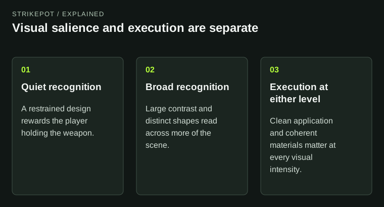
The diagram explains visual roles without assigning hypothetical designs an official rarity.
Noticeability is a relationship with the scene
A graphic is salient when it attracts attention relative to what surrounds it. Imagine an original finish consisting of a small pale mark on a dark receiver. At close range the mark might be easy to find. From farther away, the whole weapon might register as a dark silhouette. The artwork has not disappeared; its audience has changed.
Now imagine replacing the mark with a broad high-contrast shape. The second design may communicate sooner in a small image, even if it contains fewer lines. This is a useful art-direction experiment because it separates complexity from recognition. It is not a formula for assigning an official tier.
Use a comparable view when evaluating the difference. A tightly cropped image gives delicate details an advantage that the normal held view may not provide. If one design is judged close up and another at a distance, you are changing both the work and the test.
A case needs different visual roles
In its style guide, Valve describes a progression from quieter lower-tier work to more conspicuous higher-tier work. The important point is the need for a range. An entire case of designs competing for the same kind of attention would offer a narrower visual selection.
Think of an editorial display containing several objects. If every surface uses maximum contrast, large lettering and bright accents, the display may contain plenty of activity but little hierarchy. A quieter piece can supply an option for someone who wants the material or shape of the weapon to remain prominent.
Valve's historical Prisma announcement illustrates the idea of a release as an assembled set. The contents were presented together, rather than as an independent popularity contest for each visible design. That framing helps explain why a proposal must fit a role as well as look accomplished on its own.
Technical execution remains a different question
A subtle design can fail because its edges are messy, its materials look implausible or its layout breaks awkwardly around the model. A highly visible design can have those same problems. The amount of attention it attracts does not repair them.
When reviewing artwork, use separate questions. Is the idea legible at its intended distance? Is the material response coherent? Does the illustration suit the shape? Are the color relationships deliberate? Those questions produce actionable feedback. Saying that a skin looks “too low tier” often mixes several complaints without identifying any of them.
For an owner comparing issued objects, condition is another independent axis. A rarity label does not replace the actual surface review in the wear and pattern guide. The collectible category and the state of an individual example need separate descriptions.
Votes measure a response to a presentation
A Workshop vote is a response to a submission as people encountered it. The thumbnail, timing, familiarity of the concept and clarity of the page can all affect what someone notices. Those are reasons to interpret a vote count carefully, not reasons to assume it is meaningless.
Valve specifically explains that voting has limitations when finding quieter finishes. The editorial implication is that community excitement and suitability for every case role are different questions. A proposal can attract attention without filling the particular slot a release needs.
For creators, compare comments with the design decision you intended. If people recognize the theme but cannot see it in hand, presentation and application may need work. If they like a dramatic render but the actual material is unclear, gather feedback on a plain game view. Neither situation is solved by treating votes as a promised release queue.
Try variants with a reason
A useful hypothetical exercise keeps the same original motif and tests three compositions: a quiet surface texture, a medium-scale graphic and a large contrasting illustration. Do not simply label them with official rarity names. Describe what changes: visible area, contrast, saturation and recognition distance.
Then ask which version communicates its goal most clearly. The quiet version might work as an intimate detail for the holder. The large graphic might be more readable across a room. Another version might be crowded because too many elements compete. Each conclusion concerns the work you can observe.
The Workshop status guide keeps one further boundary clear: a well-presented variant is still a proposal until it is officially integrated. Art-direction analysis does not establish future acceptance.
Describe what you value instead of borrowing the tier
When choosing a personal loadout, it is more informative to say that you want subdued colors, broad silhouettes or detailed close-up art than to assume a tier guarantees your taste. The description tells you what to inspect next.
When creating, name the intended audience and viewing conditions before increasing complexity. A design succeeds when its choices work together for that purpose. Official rarity can describe where a released item sits in the game's system; it cannot replace a thoughtful account of why the artwork works.